

Role: UX designer leading the app design from conception to delivery
Product: Basil is a sandwich shop located in the suburbs of a state university. It offers dine-in and take-out custom-made sandwiches, salads, and drinks. Basil targets students with busy lifestyles who lack the time or ability to cook food. The app also provides dine-in options for students to hang out after class.

PROBLEM
Busy Students and workers who lack the time necessary to prepare a meal
For busy individuals, time presents a significant obstacle to putting a healthy meal on the table. After all, a cook needs to devote at least a small portion of their day to shopping, preparing, and cleaning up after a meal. In the Harvard Business Review, researcher Eddie Yoon shares data he’s gathered over two decades
15 percent said they love to cook
50 percent said they hate to cook
35 percent are ambivalent about cooking
GOAL
Design an app that allows users to easily customize orders and pick up fresh, healthy food

Easy Customization
The app lets users select ingredients, choose quantities, and also skip ingredients
KICK-OFF
Validation and Design Process
In Basil’s design process, we opted for a goal-directed design approach that helped us move along through the timeline smoothly. Qualitative research methods proved to be the most effective during our design process, most notably our user interviews and usability testing sessions. Whenever we encounter an issue that we are trying to solve, it's smart to build a good foundation. In Basil’s case, we did this by asking some generic but useful internal questions.

USER RESEARCH
Diving deeper into the problems
I conducted interviews and created empathy maps to understand the users I’m designing for and their needs. A primary user group identified through research was students who don’t have the time or skills to cook meals. This user group confirmed initial assumptions about Basil customers, but research also revealed that time was not the only factor limiting users from cooking at home. Other user problems included obligation, interest, cost, and obligations that make it difficult to get groceries for cooking or wait in line to place an order or pick up

PERSONAS
Meet the Users

COMPETITIVE AUDIT
Tracking competitors and seeing what makes them unique
I looked at several potential competing companies and classified them as direct and indirect competitors. Direct competitors offer the same products and services. Indirect competitors are different but could potentially satisfy the same needs and reach the same goals.
The majority of the features between competitors were very similar;, however the main difference that I noticed were
Easy Accessibility vs Hard Accessibility
Too many screens vs Simplified interaction
Bright/disturbing interface vs Minimalistic interface
Specialization of products

USER FLOW
Path taken by user on the app to complete the task
I constructed a user flow of what a basic start-to-finish journey looks like when ordering an item. This helps us understand ways the user can interact with the product, as well as allowing us to see navigation through user goals

IDEATION
Visually predicting the user’s experience with the product
Initially, I created a big picture storyboard and a close-up drawing of the user's experience with the drawing. Then I did a crazy-eights exercise that challenged me to sketch eight distinct ideas in eight minutes. The goal was to push beyond my first idea, frequently the least innovative, and to generate a wide variety of solutions to my challenge

WIREFRAMING
Paper wireframing to digital wireframing
After sketching out some P&P wireframes and thinking through the preliminary flow, I reviewed what was necessary and unnecessary and what areas needed to be improved. I poured a lot of time into this step to make sure I had the finishing touches on the underlying UX before moving on to the visual design


USER RESEARCH & ITERATION
Gathered qualitative information about users and grouped them into categories
After creating the prototype from low-fidelity wireframes, I prepared survey questions for participants to answer while conducting the usability study. I asked participants to run through different scenarios in my prototype in hopes of gathering enough feedback to use for my next set of design iterations. And mapped an affinity map based on the questions and how the participants answered

Refining the Design
I conducted two rounds of usability studies. Findings from the first study helped guide the design from wireframes to mockups. The second study used a high-fidelity prototype and revealed what aspects of mockups needed refining.
Users wanted to easily locate reservations.
Users wanted to make checkout easier.
Add a calendar to the reservation page.
Add a search icon to the home screen.
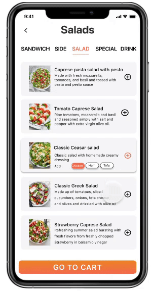
The user wanted the sandwich customization page to be more interactive.


VISUAL DESIGN
Creating Sticker Sheets in Figma
The aim behind creating a sticker sheet was to demystify the process behind creating and organizing the design system from scratch.

CHALLENGE 1
Quick, Simple & Secure
With payment methods, carts, and order specifications accessible on a single screen, it doesn’t allow the user to second-guess their order after the review screen. The design allows for minimum screen usage and a quicker checkout

CHALLENGE 2
Staying Focused
The UI consists of a two-toned orange and gray color scheme. Using colors sparingly throughout the application’s interface allows for the item to be the focal point during user engagement

CHALLENGE 3
Familiar Experience
Though Basil’s key users are students and busy working professionals, those outside the arena need to be able to use the app as well. With recognizable iconography, intuitive gestures, and a linear purchase process, I feel that the Basil app has achieved that

What did I learn?
Designers can be more than just designers - Going from only some insights to launching a product to the market requires way more than the typical job of a designer. This includes helping with the naming, branding, research, decisions, and much more
Focus on the minimum viable product - It is tempting to design more features and come up with solutions to non-tested problems. But it’s vital to get the first version of your product out as soon as possible to understand your users and iterate.
Other Projects

