
Role: UX/UI Designer
About: First and Central, Inc., a local music entertainment company, aimed to streamline the ticket-buying experience for its three concert venues by consolidating separate websites into a single mobile app.
Goal: My goal was to make it easy for users to browse events, purchase tickets, and manage their accounts—all within a single app. I focused on creating a clean and intuitive design, ensuring users could find concerts, buy tickets quickly, and access virtual tickets without hassle. I refined my designs through brainstorming, wireframing, prototyping, and feedback to create a smooth and efficient ticket-buying experience.
Persona

User Journey Map

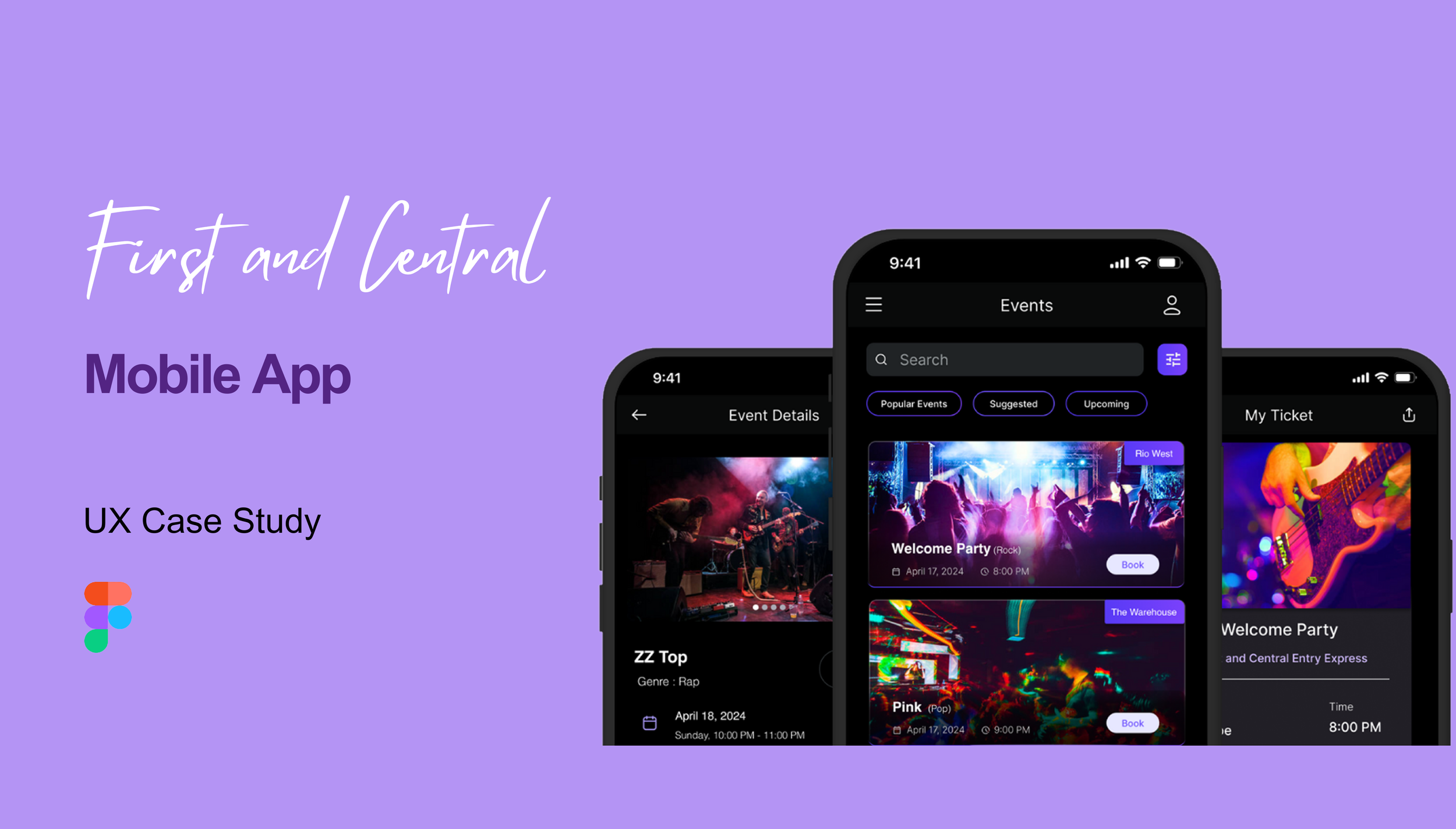
Crazy 8s Ideation: I started with the Crazy 8s method, sketching eight quick layout ideas for the Individual Event Page—one of the most important screens in the app. This page needed to clearly display event details, let users buy tickets easily, and include sharing options. Sketching different layouts helped me figure out the best way to organize all the necessary information while keeping the screen simple and user-friendly.


Wireframing: Once I had a solid direction, I created wireframes in Figma to map out the key features of the app:
Events List/Calendar: A single page showing all concerts with filters for date, venue, and genre.
User Accounts: A place where users could sign up, manage their info, save payment details, and access their tickets.
Ticket Purchasing: A quick and easy checkout process, where users could buy tickets in just one step.
I also designed error screens for things like incomplete sign-ups and exceeding the ticket limit, ensuring a smooth experience even when things go wrong.
Prototyping: Using Figma, I turned my wireframes into interactive prototypes and created user flows for:
Filtering and selecting events—users could narrow down options by date or genre and easily pick a concert.
Account creation and ticket access—showing the full signup process, error handling, and viewing virtual tickets.
Ticket purchase flow—a direct one-click checkout from the event page, following stakeholder feedback that a shopping cart wasn’t needed.
I also made changes based on stakeholder input, like removing Apple Pay/Google Pay (since they wouldn’t be ready for launch) and adding "First and Central Entry Express" to virtual tickets for a separate entry line.
Peer Review & Feedback: As part of the process, I exchanged my wireframes with three peers and reviewed their designs. This gave me fresh perspectives and helped me fine-tune my own work. Seeing different approaches to the same problem was valuable, and the feedback I received helped me improve layout clarity and usability.
Evidence of Accomplishment
Grades: 99.63% (A+)
Final Prototype Presentation = 140/140
Presentation: The final prototype presentation (attached here) presented to business stakeholders
Prototype: The final Figma Prototype (attached here)
Professor Feedback:


Summary Demonstrating Mastery
Designed a seamless event booking experience by creating a mobile app consolidating ticket sales for all three First and Central venues. The goal was to make it easy for users to find events, purchase tickets, and manage their accounts in one place.
Simplified the checkout process by introducing a one-click purchase flow, reducing the number of steps needed to buy tickets. This made the experience faster and more user-friendly, especially for spontaneous buyers.
Enhanced event discovery by adding filtering options that allow users to search by date, venue, and genre. This ensured that users could quickly find concerts that matched their interests without unnecessary scrolling.
Refined the design based on stakeholder feedback, including removing Apple Pay/Google Pay due to business constraints and adding a separate entry option for prepaid ticket holders. These changes balanced user needs with operational limitations to create a smoother experience.
Engaged in peer reviews and user testing to refine the design and improve usability. Seeing different perspectives helped me understand how small changes can make a big impact on the user experience.