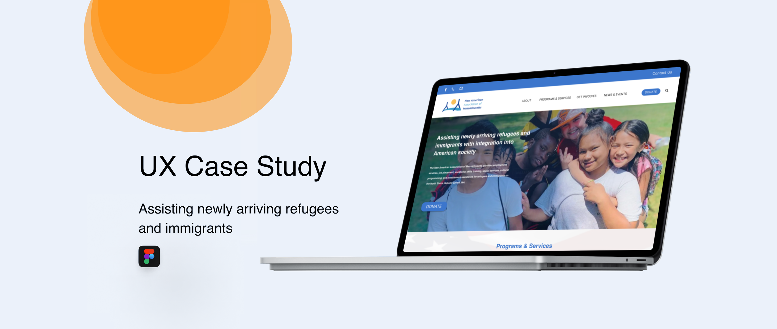
Timeline: 8 weeks (Oct 2022-Dec,2022)
Role: Lead UX designer & UX researcher
Product: The New American Association of Massachusetts (NAAM) exists to assist newly arriving refugees and immigrants with integration into American society, to promote economic stability, to build bridges with the larger community, and to foster the maintenance of refugees’ and immigrants’ cultural identities.
PROBLEM
The current website feels visually outdated
The Landing page does not have clear mission goals
The page layout does not follow the basic visual hierarchy principles
The overall website has heavy text weightage but no clear context
GOAL
Provide Feedback on the current website’s layout, user functionality, mobile-friendliness, visual design, content, and other key features
Clear articulation of the Organization’s goals for the website
Make the design pretty and minimal
Update the volunteer and Donation Form
Understanding the User
User Research
I conducted research based on Sophie’s (Volunteer Coordinator) summary to understand the users that visited NAAMAAS and their needs. The primary group of users is immigrant families, who visit the site for employment services and immigration assistance. The secondary group of users is donors who donate to the organization.
Pain points
1
The user finds it difficult to find the information they are looking for in the NAAMAAS website because of too many dropdown tabs in the main navigation
Understanding the Users
The volunteer sign-up form does not have enough details regarding the program the user wants to sign-up for
USER PERSONA
Problem statement:
Fiona is an immigrant who wants to give a better life to her family in the United States
Competitive Audit
All identical components must have the same padding and margins (buttons, forms, etc.). Everything on the website should be organized in a grid, and nothing should deviate from that grid.
Starting the Design
Accessibility considerations
1
Web designers should follow all of the newest principles and best practices in WCAG 2.1 to guarantee that their sites are accessible to all users.
Other Projects
Wireframing
2
Problem statement:
Jennifer is a retired government worker who is looking to donate to a good cause.
Tracking competitors and seeing what makes them unique
I looked at several potential competing companies and classified them under direct and indirect competitors. Direct competitors offer the same product and services. Indirect competitors are different but could potentially satisfy the same needs and reach the same goals
3
Using more visuals than textual boosts up the speed as users now recognize the visuals much faster.
The header takes up too much real-estate on the home page and the contact number disappears while scrolling
The donor page is not too user friendly


